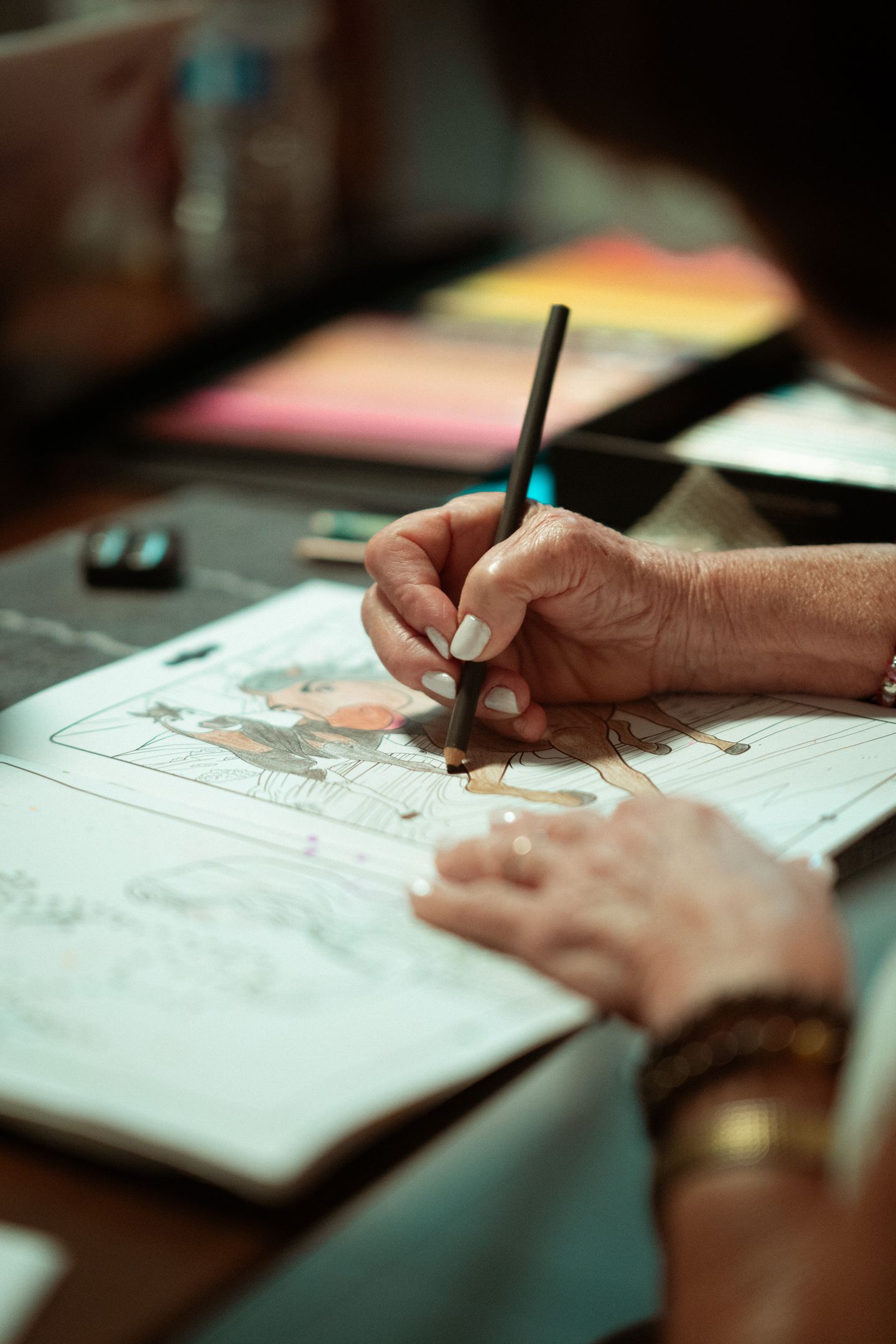
Easy and detailed coloring pages offer different kinds of decisions. A page with large, open spaces gives you room for broad marks. A detailed picture offers smaller areas, repeated shapes, and more choices about where colors go.
Neither format is automatically better for relaxation or artistic progress. Choose the kind of work you want to do today, then adjust if it feels too demanding or too plain.
What makes a page feel easy?
Clear outlines, large shapes, and fewer separate areas can make a page straightforward to begin. You can choose a color and fill a space without planning many small details.
That can suit a short session or a tool that makes broad marks. It can also leave room for your own additions, such as a background pattern or an extra object.
Simple does not mean that the finished work must look basic. You can explore color, texture, or small variations inside a large shape if you want. You can also color it in one flat shade and leave it there.
What does a detailed page offer?
A detailed scene may give you many small areas to return to over several sessions. You might enjoy deciding how a repeated pattern changes or how different parts of a scene connect.
Look closely before choosing your tool. Very narrow spaces may be awkward with a broad crayon or marker. Try a small section rather than committing immediately to the entire picture.
Detail is an option, not a requirement for adults. A complex picture does not demonstrate greater creativity simply because it takes longer to fill.
Match the page to the session
Ask yourself three practical questions:
- Do I want a few decisions or many?
- How much space can my current tools comfortably color?
- Would I like to work on this image across several sessions?
A large animal outline might suit a short break. A busy scene might appeal when you want to explore a picture gradually. Those are preferences rather than universal rules.
If a page becomes frustrating, you can color only the part that interests you, leave smaller details empty, or choose something else. You do not owe the page a finished background.
Compare the artwork rather than the label
Terms such as “bold,” “easy,” and “intricate” are useful clues, but actual previews tell you more. Check the smallest areas, the spacing between lines, and how much of the page is filled with detail.
For a printable book, inspect known file dimensions as well. A design that looks spacious on screen might feel different at the printed scale. Our printing guide explains how to preview and test a page.
Do not assume that a mandala, animal, or floral theme tells you how difficult the picture will feel. Each theme can be drawn with either simple or detailed shapes.
Choose enjoyment over a hierarchy
You can use different kinds of pages on different days. There is no need to progress from easy pages to detailed ones unless that is something you want.
Research does not establish that greater complexity guarantees greater calm. For a balanced look at coloring and anxiety, read our evidence explainer.
Start with a picture you want to spend time with. If selecting colors is the part that makes starting difficult, our beginner tips offer a small palette and a manageable first step.