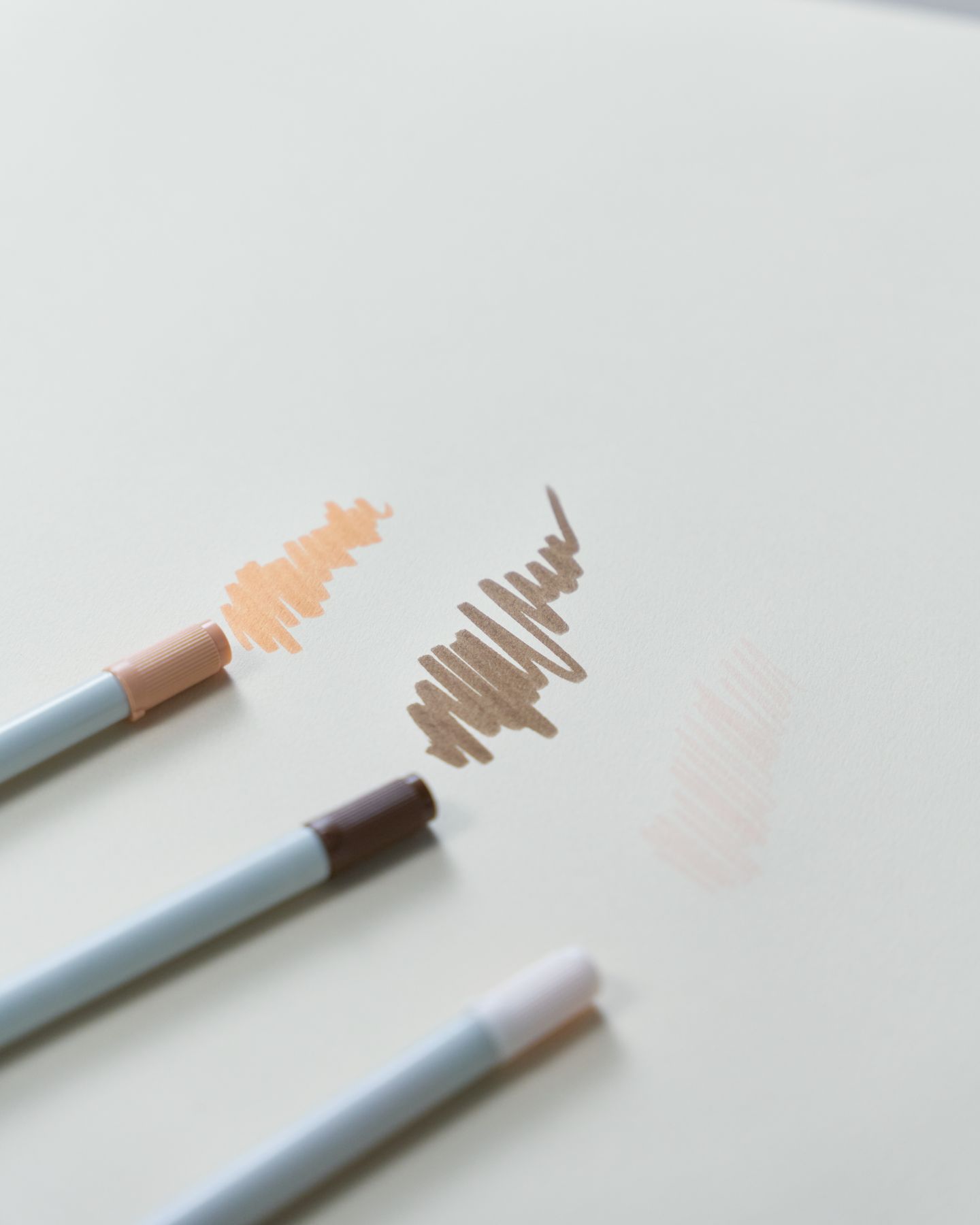
Choosing colors can be part of the fun, but a large pencil set can also leave you wondering where to begin. A three-color palette gives you a small starting point: one color for the main subject, one for a supporting area, and one for a detail.
Try these combinations on an animal coloring page or on a few shapes you draw yourself. They are creative suggestions, not promises that particular colors will change your mood.
Try the colors together first
Make three small marks on scrap paper. Actual pencils and crayons can look different from their labels or a swatch on a screen, so choose by the marks in front of you.
You can use shades close to the names below. There is no need to find an exact color code or buy a new set. If one combination does not appeal to you, exchange a color before starting the page.
Palette 1: Warm brown, leafy green, and golden yellow
Try brown for the animal, green for a plant or part of the setting, and yellow for a small detail. Repeating the yellow in two or three places can connect different areas of the page.
If your picture has no plants, green can still work for a scarf, a shape, or an imagined background. The drawing does not have to dictate every color choice.
Keep some areas uncolored if that gives the picture enough breathing room. White paper can remain part of the composition.
Palette 2: Blue, peach, and muted purple
Use blue for the largest area, peach for a smaller feature, and purple for accents. Or reverse those roles if the peach shade is the one you like most.
A blue animal is allowed. This is an opportunity to explore a combination rather than reproduce a reference photograph.
Try repeating the main color in a small background detail. That is one way to make the palette feel connected without adding another color.
Palette 3: Coral, teal, and a neutral gray
Try coral and teal on neighboring features, then use gray where you want a quieter supporting area. If those two bright colors compete, use more of one and less of the other.
Test the combination on a small section first. Some tools have stronger color than others, so the balance may change depending on what you use.
If you prefer a gentler contrast, try lighter marks or substitute a less saturated shade from your own supplies. You do not need to label the result calming or energetic to decide whether you like it.
Change the roles before adding colors
If a palette feels awkward, try exchanging which color fills the large and small areas. You may find that the same three colors look quite different with another balance.
You can also leave one color out. The three-color format is a way to begin, not a limit you have to obey.
Keep a scrap-paper swatch if you want to remember a combination. If your license allows another print of the same page, you could try a different palette later; check those terms first rather than assuming repeat printing is unrestricted.
Choose your own version
No palette is the right choice for every person or picture. Let the colors you already have and the parts of the page you enjoy guide the experiment.
For more practical starting points, see our beginner coloring tips. If you are looking for a family activity, choose colors together and let each person make a different version.